Company: Converge Well
Task: Enhancing existing logo and creating graphic bundle of designs and elements for coaching company Converge Well for using on the website.
Project duration: 2 month
Order list:
1. Horizontal and vertical a logo
2. Color scheme
3. Web-page banner
4. Backgrounds and design elements for web-page
5. Icons design for website
6. Illustration for website
7. 2-pages brochure "Balance Wheel"
Heather, the founder of the coaching company Converge Well, needed an enhancement of the existing logo design request. She also wanted to launch the site, so we agreed on a list of required designs.
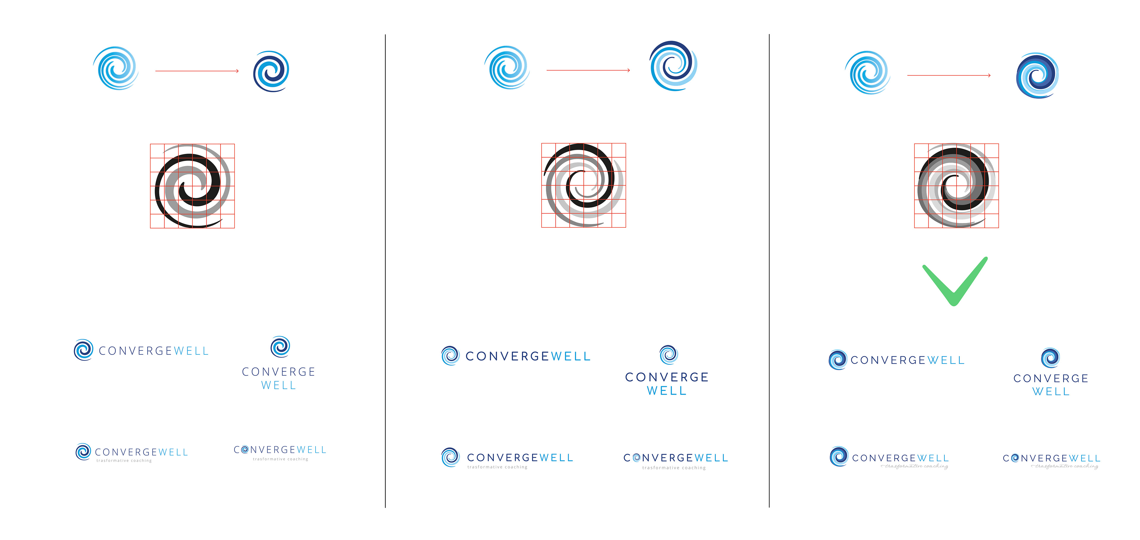
The main task was to improve the logo without changing the overall concept. To do this, I offered three options.
1. Three logo enhacement concepts
Why is there a request to improve the logo? In my practice, it is not always necessary to completely redo the logo to make it excellent. I think refining the logo is better than redoing it because we save the efforts of previous specialists. We look at what good we could take from the existing concept and base the new design on it. A brand is never one person's work result; it is always the work of a collective mind. Only in this way does the brand become real.
The main good feature of the previous version is simplicity and readability. What can be improved in the new version is to make the lines more explicit and more structured and make a difference in tone.
I chose three directions for finalizing the sign in the logo: 1) reducing the number of lines; 2) maintaining the number of lines 3) increasing the number of lines. After we chose the third option for further development, I searched through font combinations.
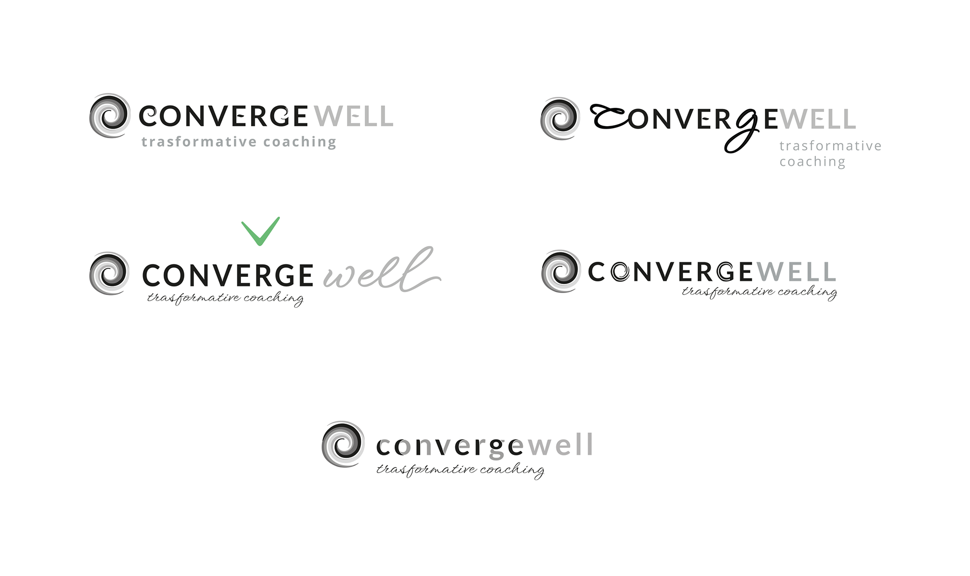
2. Exploring font combinations
When it comes to fonts, there have been many variations and several iterations. The main idea was to use a calligraphic font to balance the roman style. At the same time, the logo's readability remained the main criterion when choosing the final version.
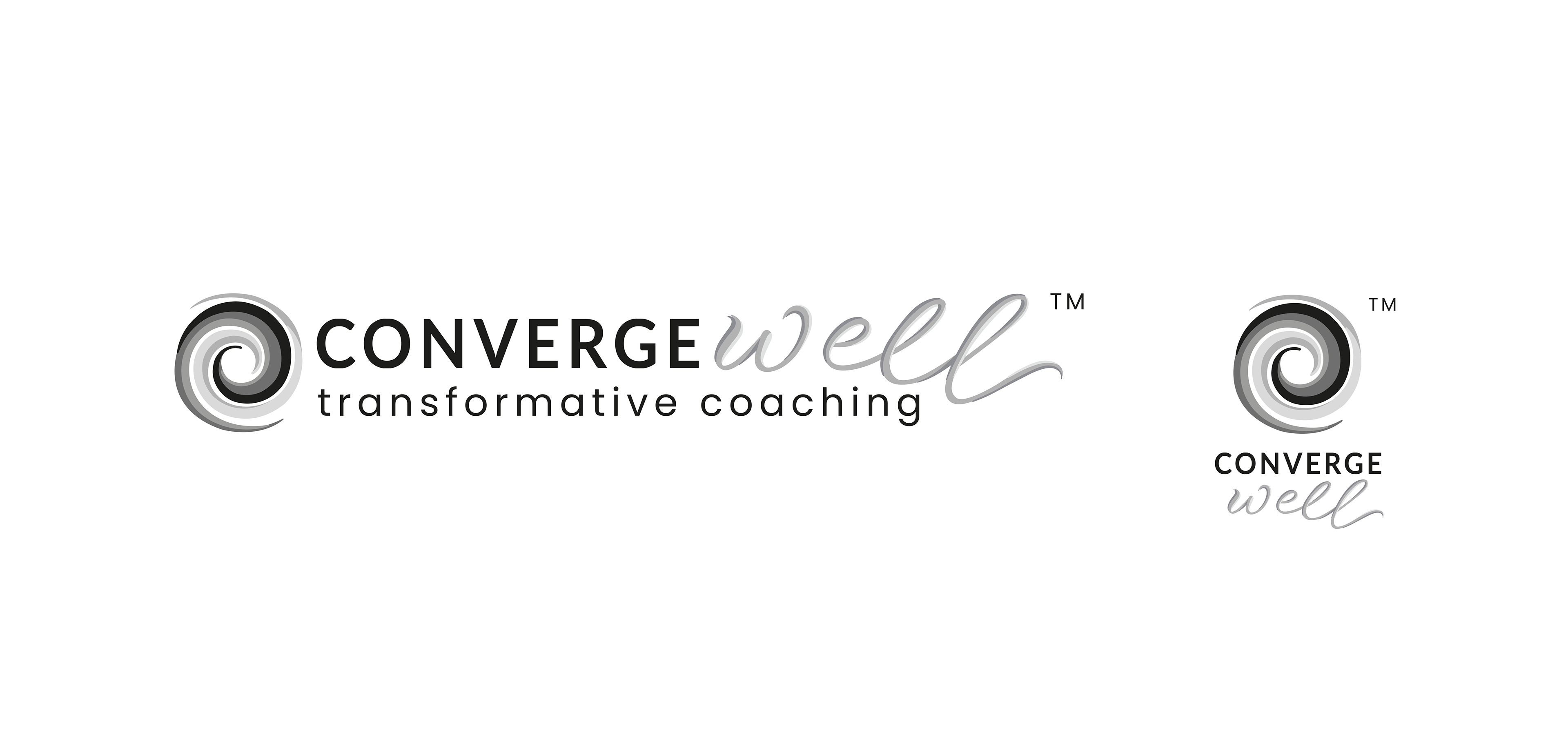
3. Approved Conwerge Well logo, grayscale version
Logo design always begins with a black and white version. It maintains the tone and contrast balance in the logo. It is essential to have a grayscale logo version in case of printing on a black and white printer or fax. On any medium, the logo should look clear. Once the black and white version of the logo is ready, a color scheme is needed for the future brand.
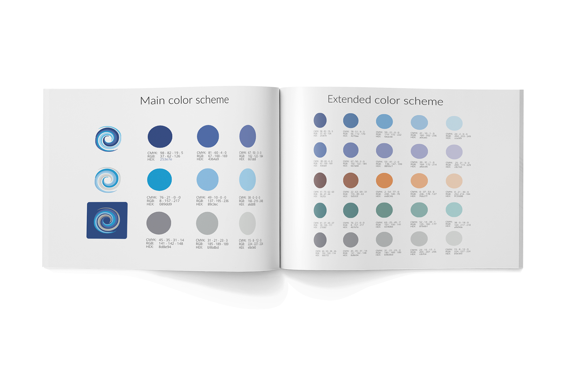
4. Main and exteded color scheme
The color scheme is ready. It helps keep the project in a solid color field. Thanks to this, all the designs look harmonious. Heather's main wish for Converge Well color scheme was the presence of blue and blue tones. When creating color samples, I relied on natural hues.
For the primary palette, I took three colors with three tonal gradations; for the extended—I took five colors with five tonal gradations. Thus, we can easily combine the colors.
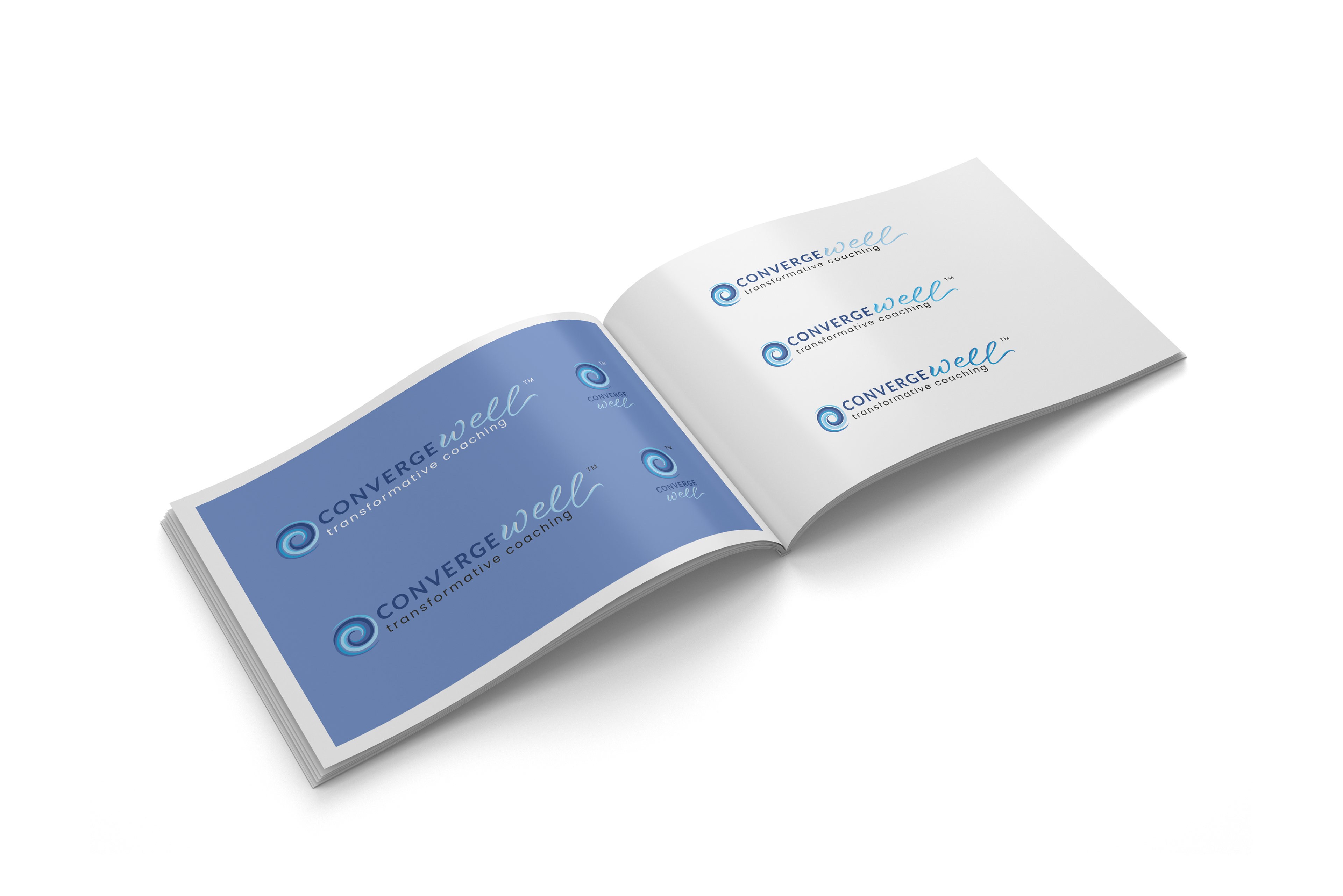
5. Approved Conwerge Well logo, color version
It's time to try out the colors, and I created a color version of the logo and went on with the banner, background and illustration.
Being a brand designer, I am able to understand what the client wants. It always takes time to explore one's tastes and visual preferences. It's hard to do this just by email, so Heather and I scheduled ten online zoom meetings to discuss progress and get feedback.
For example, Heather wanted both designs and elements to use in further work, like one illustration in three formats (rectangle, square, round) and used images separately. Heather launched the Converge Well website using all the graphics, images, and colors I made for her request.
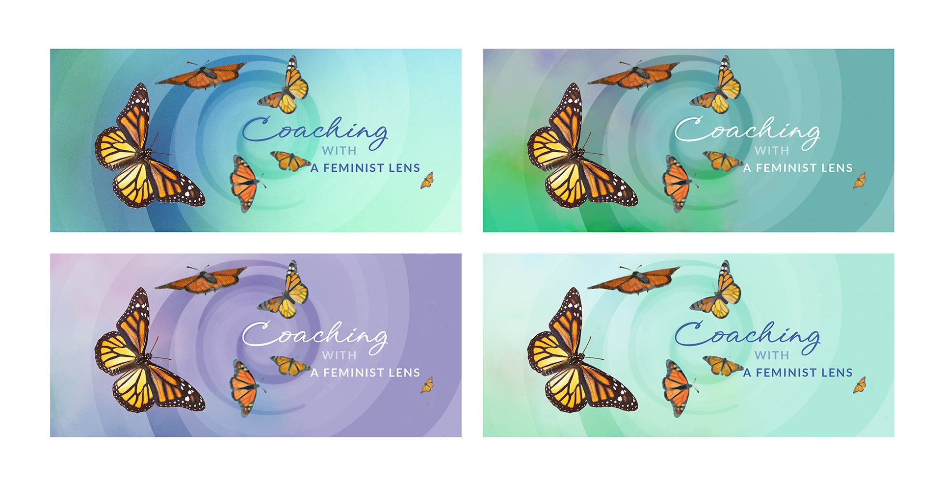
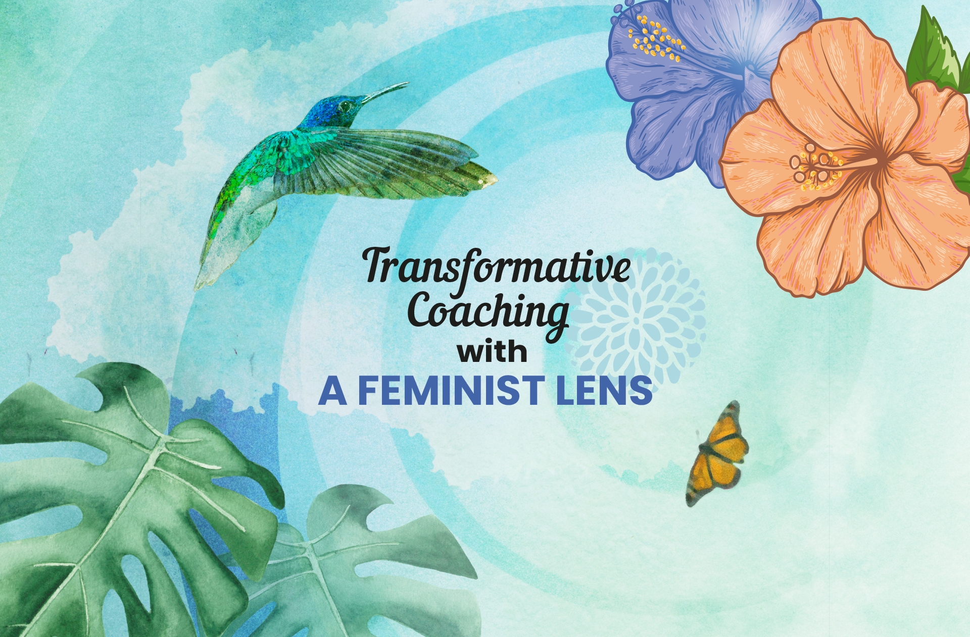
6. Banner design with background variations for website
The design should be variable so that there is visual variety and flexibility. I developed a banner style in background versions, which Heather later used on her website.
At Heather's request, I used the image of a butterfly as a symbol of transformation when a caterpillar turns into a completely different creature, a butterfly. Against the background, I repeated the waves used in the logo to create a visual rhythm.
In addition to the design itself, I handed over the design elements separately (background and butterflies) for independent use.
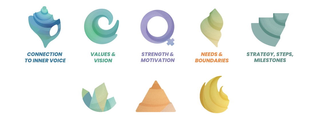
7. Icons for website
Based on the logo, I also designed eight icons for the Converge Well website—five primary and three extra.
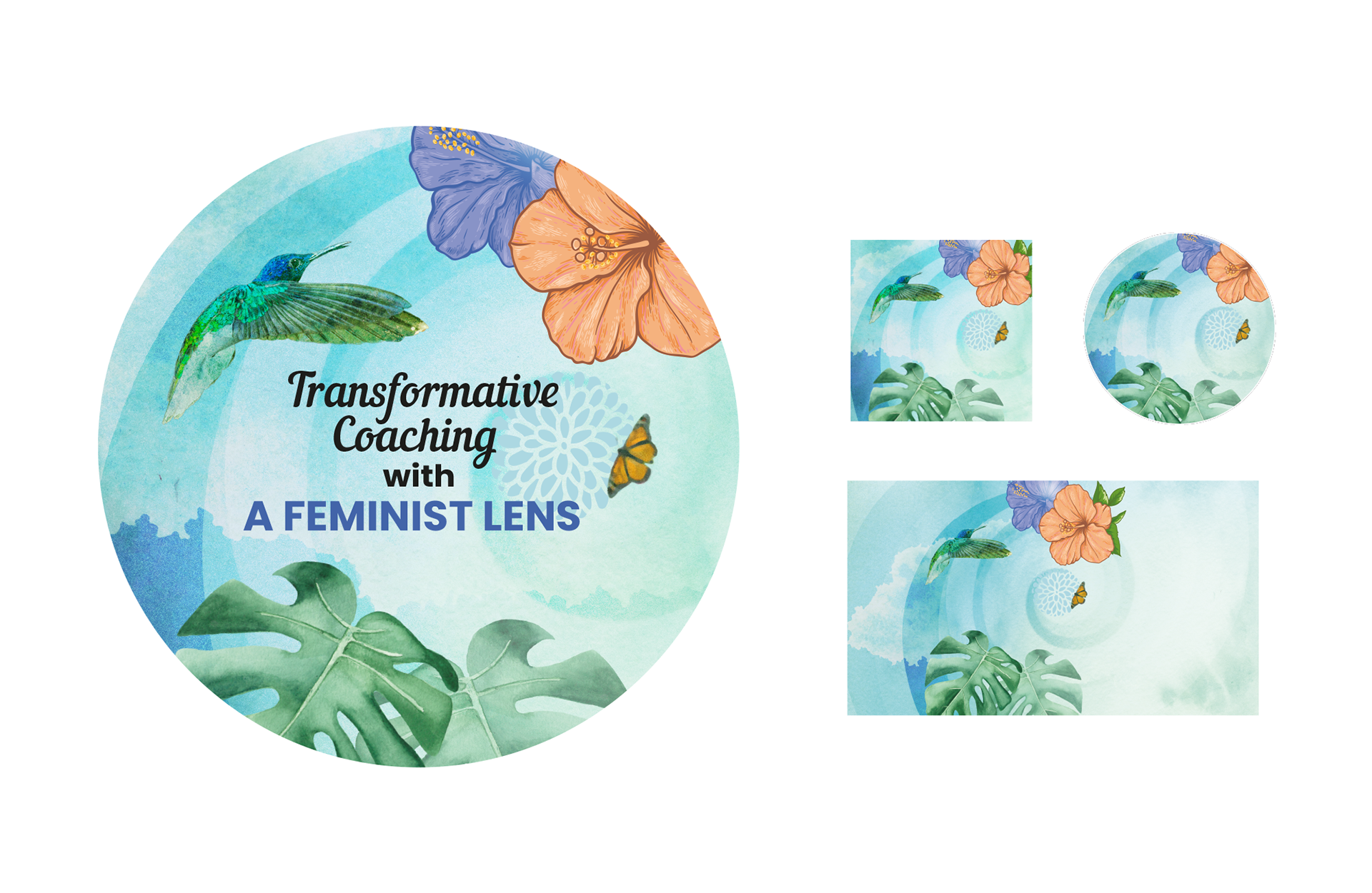
8. Illustration for website and backgrounds
I developed an illustration for one of the website blocks based on Heather's wishes. Collage became the main principle. This illustration and elements we used in the two-page pdf brochure "Wheel of Balance".
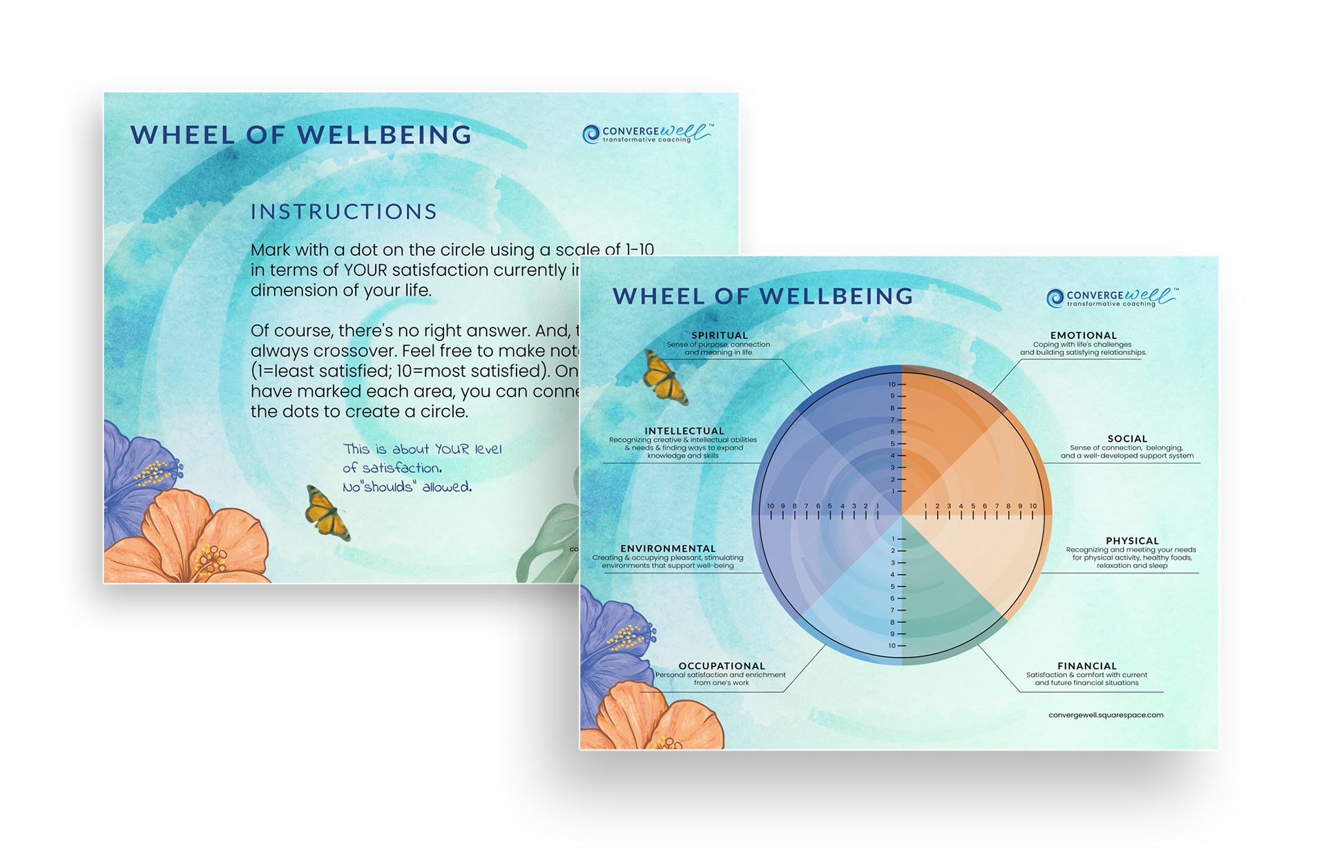
9. 2-pages PDF-brochure "Balance Wheel"
A business always inherits the character of its founder. It is why I always rely on the taste preferences of my clients. The more accurately we do it, the more satisfied the customer is.
Result
Thanks to the graphics package I developed, Heather was able to design the website herself, which received positive feedback from visitors.
Customer's Feedback

Thank you, Mariya. My website is what it is in large part because of the beautiful graphics and branding created by YOU! (logos, icons, color scheme, backgrounds, etc.) I have LOVED working with you. You took my vision and made it come alive. THANK YOU.
Heather Ramsey,
founder of the coaching company
Converge Well
founder of the coaching company
Converge Well

Fill out the contact form if you need a corporate design for your company. I will carefully study your materials and offer you the best solution. I guarantee that the result will meet your expectations.
Thank you!