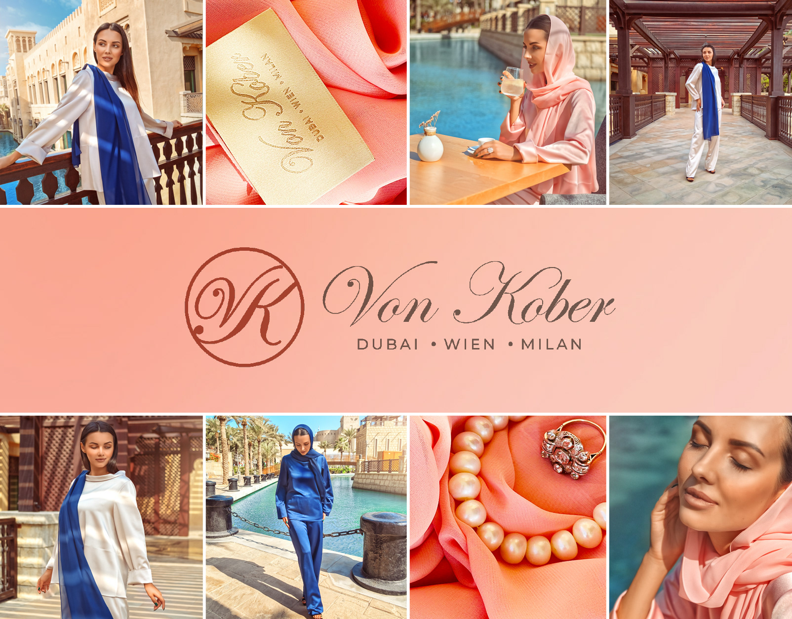
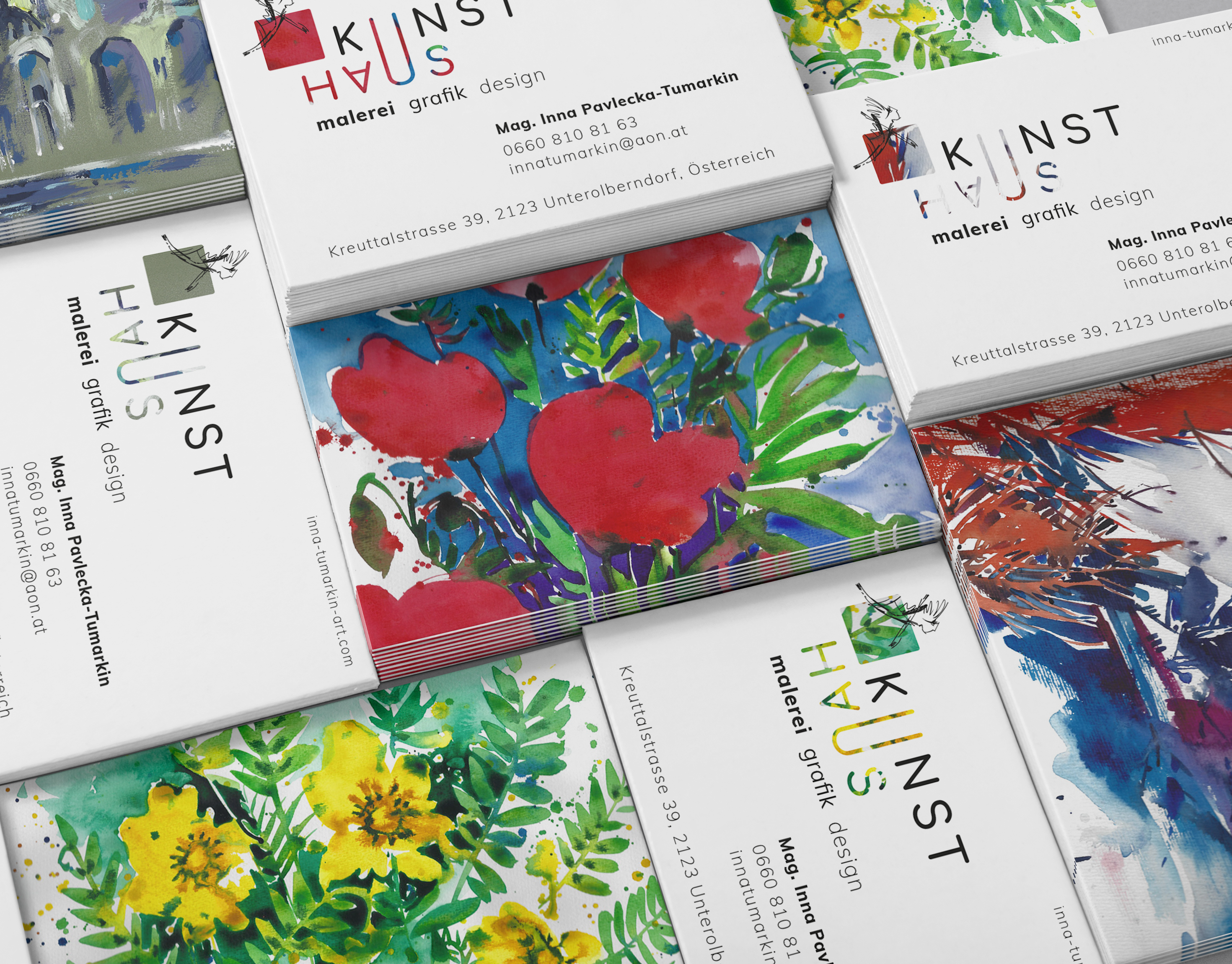
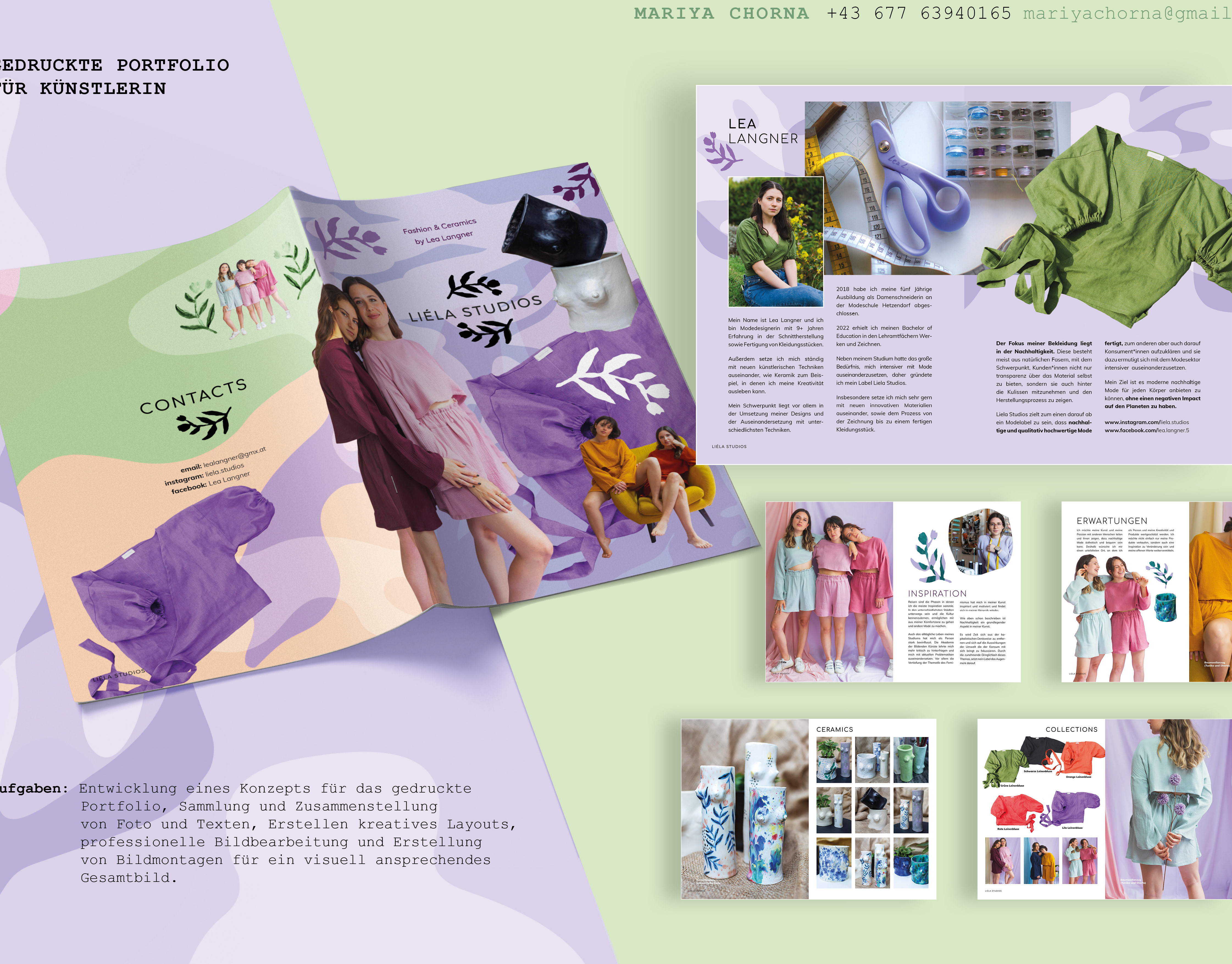
Text and identity design
by Mariya Chorna
by Mariya Chorna
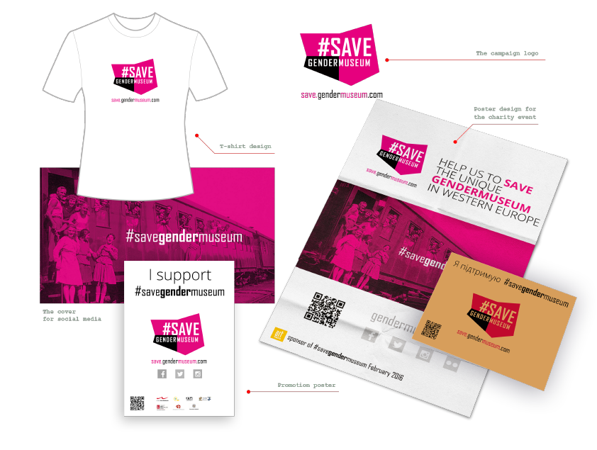
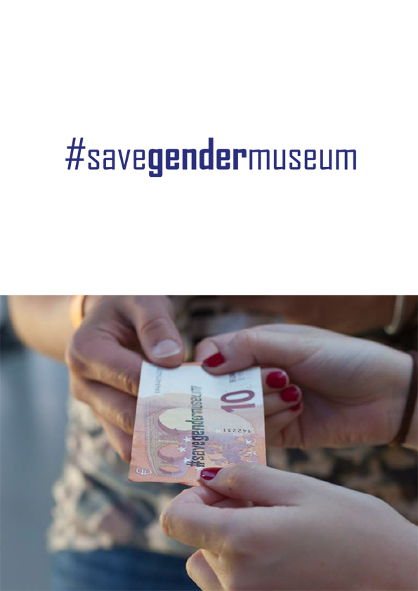
Brand identity for fundrising campaign #SaveGenderMuseum
Imagine a small museum in Kharkiv, Ukraine, that tells the stories of women's history, their struggles, and their accomplishments. The Gendermuseum is a critical cultural perspective that needs to be preserved. Unfortunately, the museum was at risk of being shut down, and that's when we embarked on a new experience and created the #SaveGenderMuseum campaign.
What is Gendermuseum and why do we need to save it?
Gendermuseum - the idea and initiative of Kharkiv feminist Tatyana Isaeva. Such a project is necessary because it tells the story of women's history, women who worked during their lives but remained unknown, the difficulties they encountered and the results of their labours enjoy the modern world.
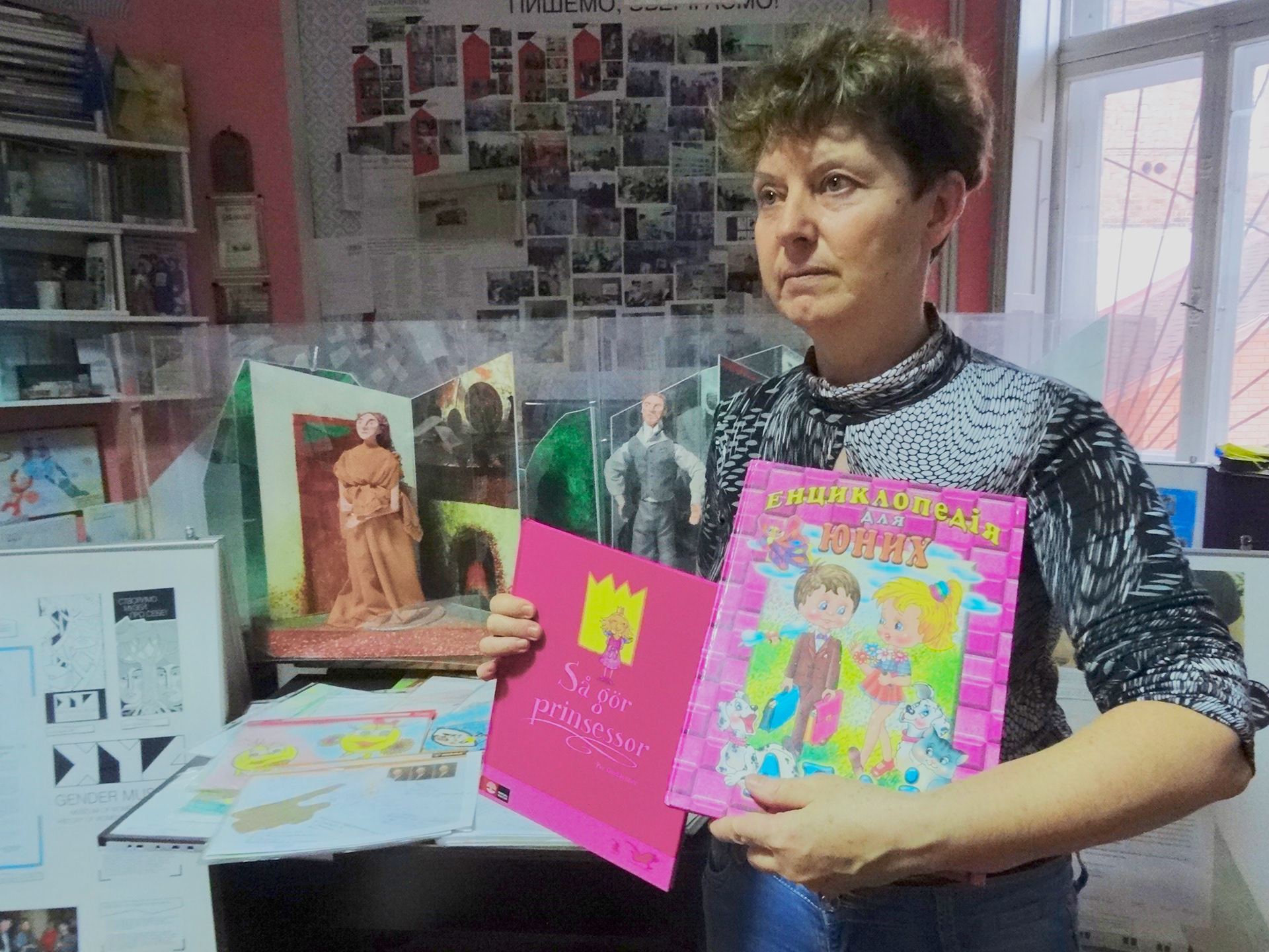
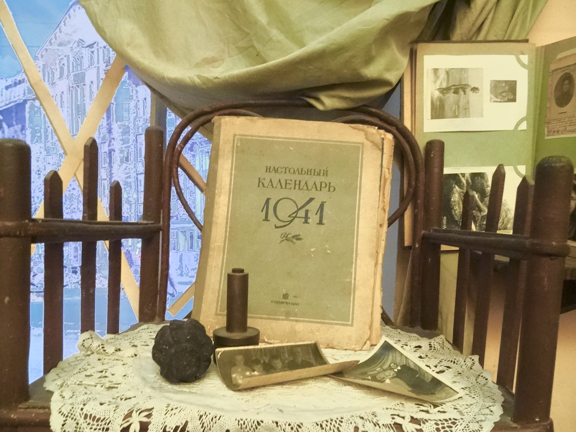
Gendermuseum as an idea and personal initiative of Tetiana Isaieva
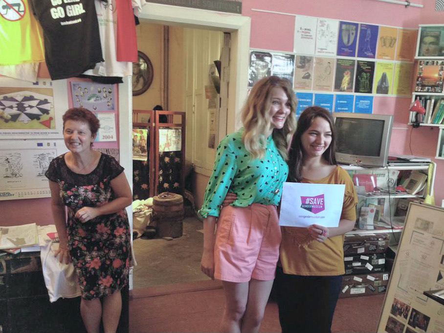
Maria Sanchez, a passionate researcher and art manager, proposed the idea to create the fundrasing for Gendermuseum. It was a great opportunity, and we designed the brand identity that would help save the Gendermuseum.
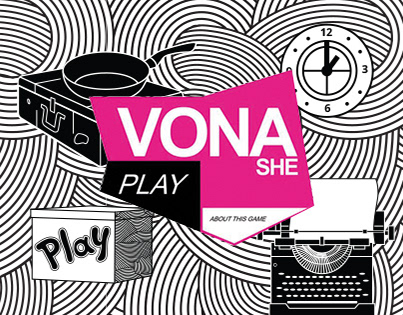
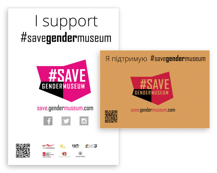
The campaign aimed to reach ordinary people who could contribute voluntarily every month. We created a simple and memorable brand identity that reflected the campaign's independent nature. The logo, t-shirt, money box, pin, poster, stamp, and website were all part of the fundraising campaign's brand identity.
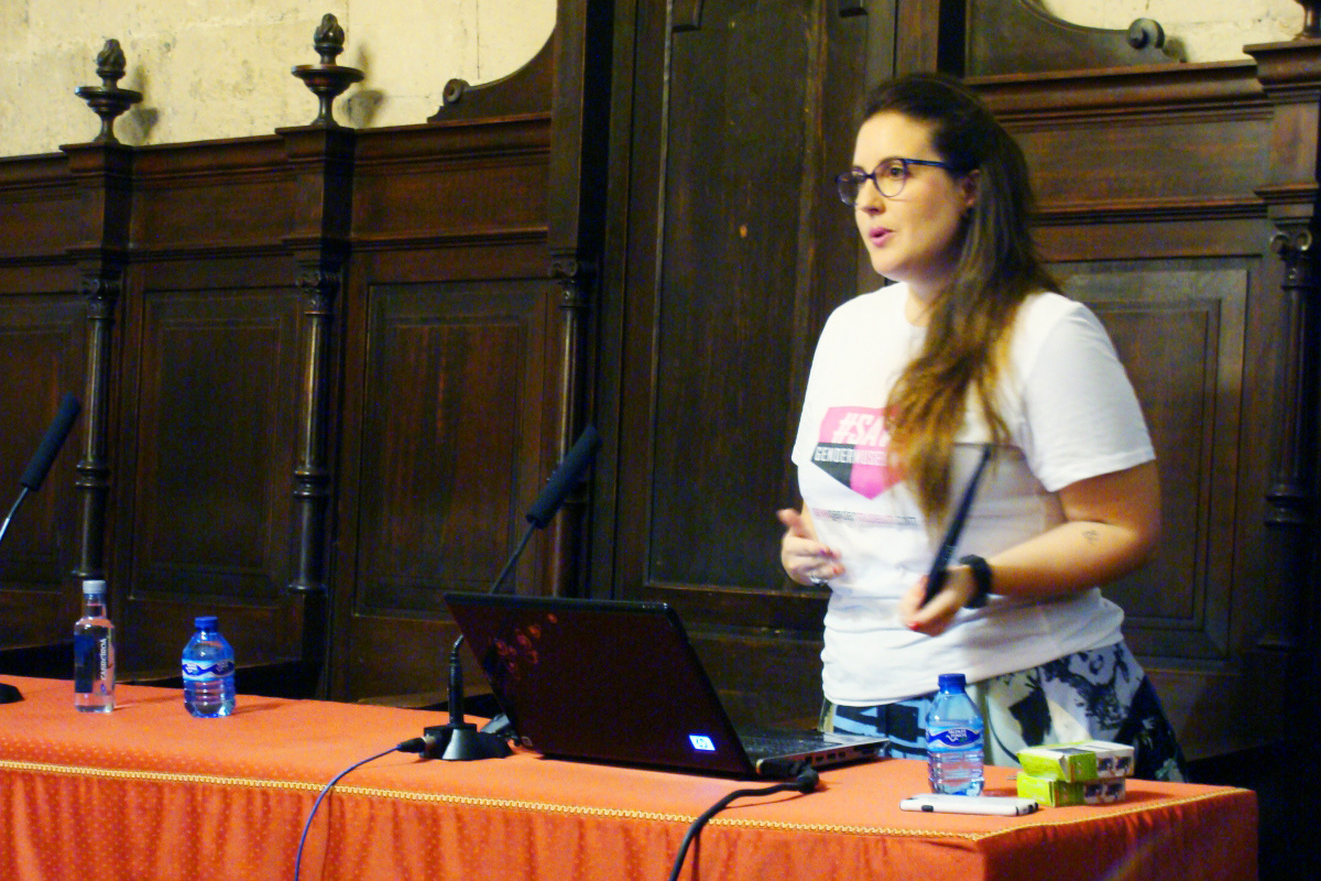
Maria Sanchez, art manager, researcher and Spanish activist is promoting #SaveGenderMuseum at the event
Fundraising campaign as a brand
To make the #SaveGenderMuseum campaign a success, we aimed to create a design that would resonate with people; something memorable and straightforward, that would capture the essence of the campaign's mission, so as it's name - #SaveGenderMuseum.
Since we were not planning to make a complicated brand identity, We were constrained with creating print products, so we kept the design as simple as possible.

The cover for social network

Color and grayscale #SaveGenderMuseum campaign logo

Poster design for #SaveGenderMuseum campaign
Poster designs for #SaveGenderMuseum campaign

T-shirt design for #SaveGenderMuseum campaign

Website for #SaveGenderMuseum campaign
Color solution
We chose magenta as the primary color, which is modern and dynamic, giving energy to the campaign. We associate it with neon and fuchsia. It is connected to femininity, but we do not want to make it tender.
Feminist and gender-related subjects are always linked to fighting for women's rights, overcoming difficulties and barriers, and facing challenges. The magenta colour invites the audience to take action. At the same time, magenta is attached to kindness and tolerance, which leads us to the concept of diversity acceptance.
The secondary colors are black and beige. The black we use for the contrast, which makes the layouts vivid and vibrating. The beige reffers us to vintage and history, like pages of old books.

Brand campaign colors
Logo
The logo is connected to the heart shape, which means support and gratitude. We used straight lines to create directness and heading toward the aim. Women receive a salary 20% less than men in the same positions. It is why the black spot appears at the lower left logo corner. It's something missing that we want to find and recover.
The logo remains that women are payed less than men
Typography
For the typography of #SaveGenderMuseum, we opted for the Bravo font, an accidental grotesque with a narrow design. It is comprising three tracings: normal, small caps, and screen, and more than 600 characters in each face. The font's narrowness made it suitable for long words, such as the campaign name, while its simple shape with straight lines conveys a sense of directness and the ability to achieve the target.
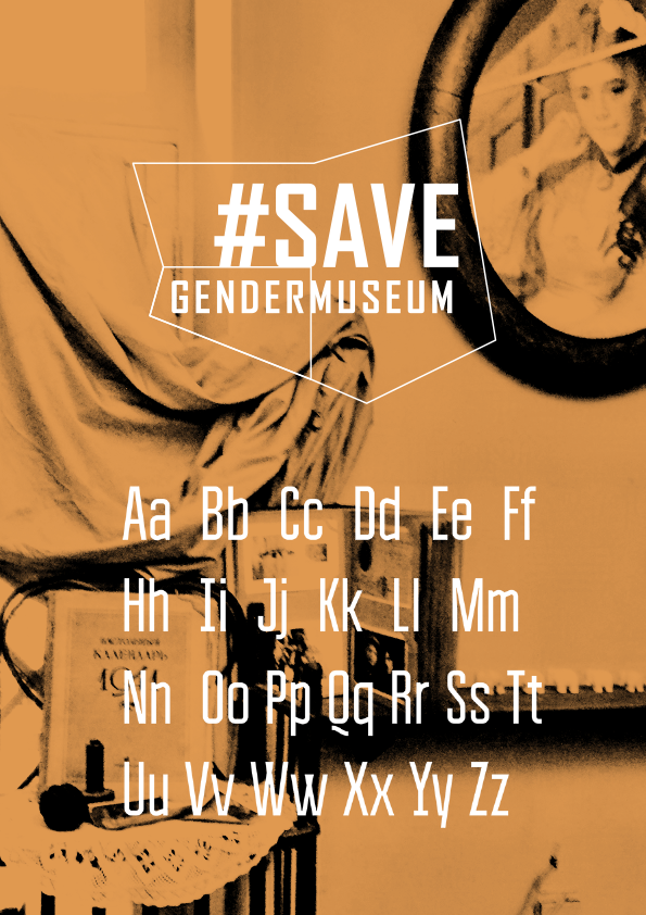
Straight and direct typography gives stability to the logo, which is balancing on the point
Imagery
Each month we received photos from individuals who supported #SaveGenderMuseum and wanted to ensure that they had a cohesive style. To achieve this, we utilized a magenta filter as the primary and active color to provide consistency and color to the photo images. As a result, the #SaveGenderMuseum branding imagery showcases a consistent magenta filter applied to all photos.
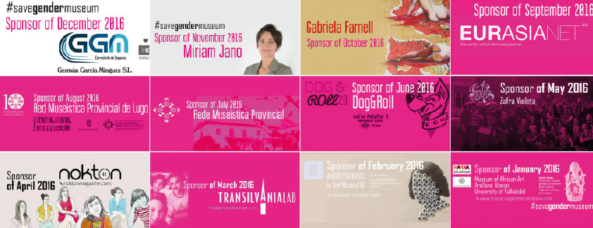
The arcticle covers for blog articlrs about Gendermuseum sponsors inherit magenta color
Website
In addition to the branding imagery and typography, a website was created for the #SaveGenderMuseum campaign. The website includes a main page and a blog, with a focus on keeping everything as simple as possible, given the campaign's primary goal of saving the Gendermuseum. The website design is minimalistic, with graphics and photos taking center stage.
The main page provides essential information about the Gendermuseum and why it needs to be saved. The blog features information on people and organizations that have supported the Gendermuseum each month. The call-to-action on the website is a donate button, which is prominently displayed. To ensure consistency, the active magenta color was used again for the donate button.
Additionally, the #SaveGenderMuseum campaign was ultimately successful in its efforts to save the Gendermuseum, and a feminist video game was developed as part of the campaign. The game features unique black and white graphic drawing style, which adds to its artistic appeal. This style was also used as the cover image on the top of the main webpage.

The main webpage cover in black and white style
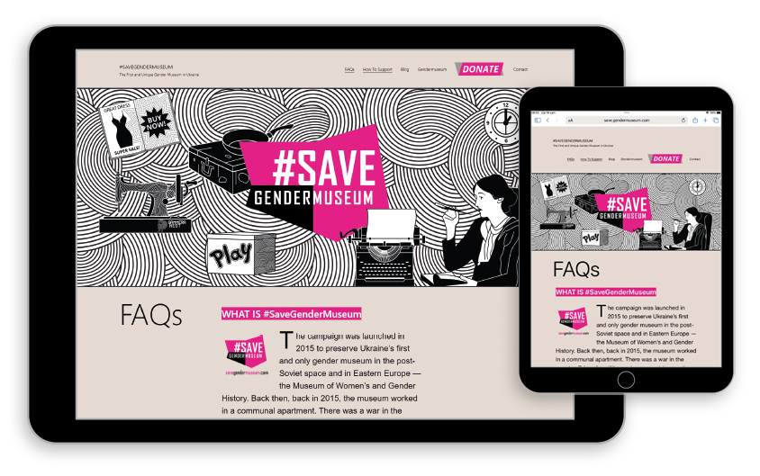
The website for the campaign
Services
- logo design;
- t-shirt;
- money box;
- pin;
- poster;
- stamp;
- website.
- t-shirt;
- money box;
- pin;
- poster;
- stamp;
- website.
Credits
- Tetiana Isaieva, Gendermuseum founder and director
- Maria Sanchez, #SaveGenderMuseum Campaign author and manager
- Mariya Chorna, brand identity designer
- Kateryna Palanska, Spanish and Ukrainian translator
- Maria Sanchez, #SaveGenderMuseum Campaign author and manager
- Mariya Chorna, brand identity designer
- Kateryna Palanska, Spanish and Ukrainian translator
Summary
Of course, we must remember that the fundraising campaign's success depends on the communication strategy and not only the design itself. In simple terms - it all depends on who will tell and who will hear the story. And quality design will accompany this communication along the way.
Looking back at participating in #SaveGenderMuseum as a brand identy designer, it was a successful experience, thanks to which we managed to keep the Gendermuseum for two years.
Whether it's a commercial company or a non-profit organization, a strong brand identity is crucial for success. It's what sets an organization apart from its competitors and creates a connection with its audience.
If you want the visual for your marketing communications, please write to me in the form below, and I will contact you as soon as possible.
Thank you for your message, I will contact you soon!